

Data Journalism has often been purported to be a guaranteed way of getting your pitches picked by publications. Big numbers, small numbers it doesn’t matter as long as they contribute the thinnest veneer of ‘fact’ to your pitches.
So here we go, 4, 6, 6, 9, 12, 17, 19, 26, 23. 22, 25, 25, 26, 31, 35, 38, 39. 40, 41, 41. Engaged? No? What if I told you if those numbers represented the percentage of Winter Olympic athletes who were female between 1924 and 2018. Interested? Somewhat? Not really, but that’s exactly how your pitch reads. Maybe you go the extra mile and put in a table, but in reality, you’re writing a series of numbers with a few fluffy words thrown in between.
Now, instead of wasting your word count on dates and percentages, you should scrap a thousand words and throw in a picture instead:
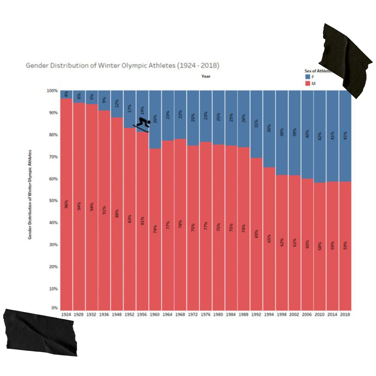
And there it is, a single image that tells the entire story. So how did we go from a string of numbers to something that a journalist will actually engage with? To answer that, we must first ask…
What is data visualisation?
Put simply, data visualisation is the graphic representation of data. Whilst graphs and charts are the simplest forms of data visualisation, they are by no means the only way of representing data. Visualisations can be animated, placed into infographics or they could be real-world objects. I mean think about it, every city skyline is just a bar chart for how high each building is.
To be clear, you’re no idiot if you can’t process thousands of columns of Excel madness in any meaningful way. I mean, I can’t do that and I’m a digital PR expert, writing as an authority on this topic. This human inability to process large amounts of raw data is why we use graphics/visuals to see patterns and trends. With some Excel wizardry (or Tableau or whatever magic) you can turn that raw data into a graph of some kind. Cool, now what?
How to interpret and visualise data without losing your head
Ask yourself, what’s the story you want to tell? You found this data for a reason and understanding what the data is and what you want it to show will be the deciding factor in how you visualise it. Other factors include how large the dataset is, what is the type of data used and how the different elements of the data relate to one another.
Rather than run through every single data type and what the best way to represent them is, we decided to do something different. With the Winter Olympics around the corner, we took the time to analyse the last century of Winter Olympics data and create a few ‘stories’ and visualisations to highlight what kind of charts you should be using (in general) for each data type.
Bar charts
A bar chart is a hammer in the data visualisation toolbox, it can be used for nearly any problem and is as easy as drawing a few straight lines, but that doesn’t mean there isn’t an element of complexity built into each one.
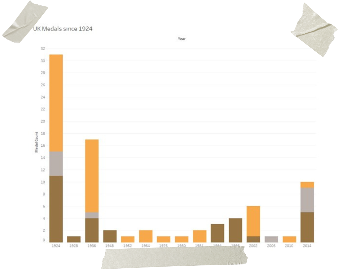
Let’s take the example of how many medals the UK team won in each Winter Olympics. If you look at the first bar chart, you would see that the 1924 Winter Olympics teams won the most medals overall.
Starting off with a stacked bar chart gives a medal overview, but is far less useful when trying to determine how many of each type of medal was won in each year. You cannot tell at a glance in which year the UK team won the most of each medal type. However, it is the best use of space out of any of the subsequent types of bar charts, and if you are looking for overall medal wins then this chart is your best bet.
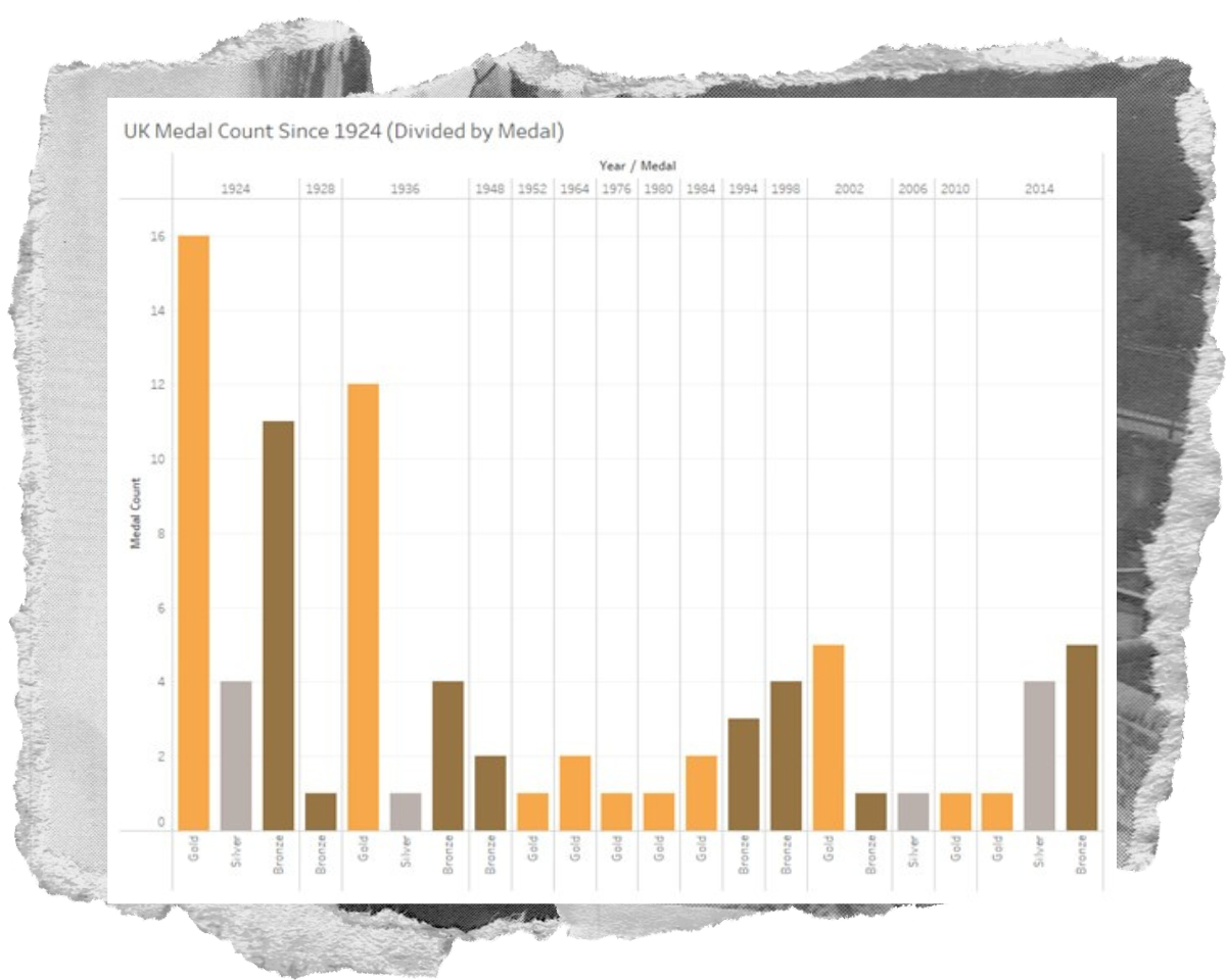
Placing the medals into separate columns increases the complexity of the chart, which in this case is less aesthetically pleasing than a simple stacked chart. However, it is far better at giving a more complete picture of the medal counts over the years. It allows for better comparisons across the years, but as we will go into later, it is not the best way to show this comparison over time.
Add one more layer of complexity and the story becomes far clearer. 1924 and 1936 have such high gold medal counts because the UK won in team events. Alpinism and Men’s Ice hockey have 12 members in a team. Each one of those team members would then get a medal. Speaking strictly from an events perspective, the UK team won as many events in 1924 and 1984, but that wouldn’t be evident from the first two charts.
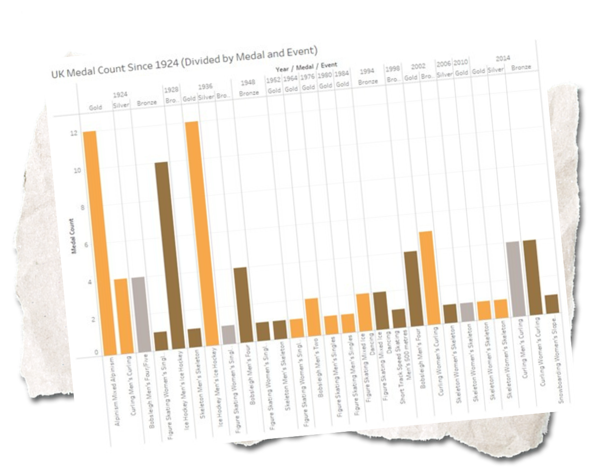
Which chart to choose depends on the story you want to tell. If you want to talk about the decline of UK medals won, then the first chart is for you, if you want to tell the same story but about Gold Medal winners then the second chart is for you. If you want to explain the disparity between the medal count then the third chart is best suited to your needs.
But, as we said, bar charts are the hammer of data visualisation and if the only tool you have is a hammer, you tend to see every problem as a nail. There are far better ways to represent the above data, but it entirely depends on the story you are telling.
TreeMap
If you’re feeling woozy from all the bars, then let’s take a break to the countryside and talk about treemaps. Treemaps are a great way to spot trends that you might miss with other kinds of charts.
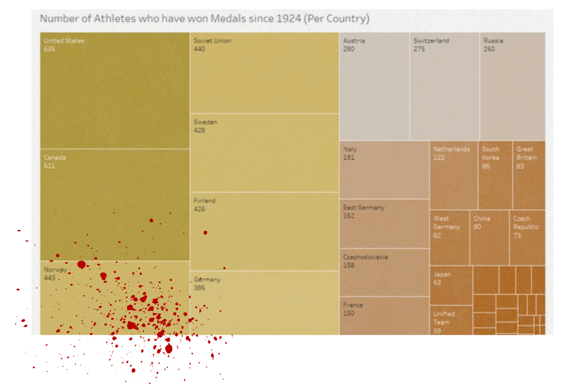
This list of medal winners could have also been placed in a series of bar charts. However, a treemap makes the most efficient use of space. You could even create a treemap for each medal under a hierarchy of medal winners. This would keep the complexity down and would simultaneously include more information.
Line graph
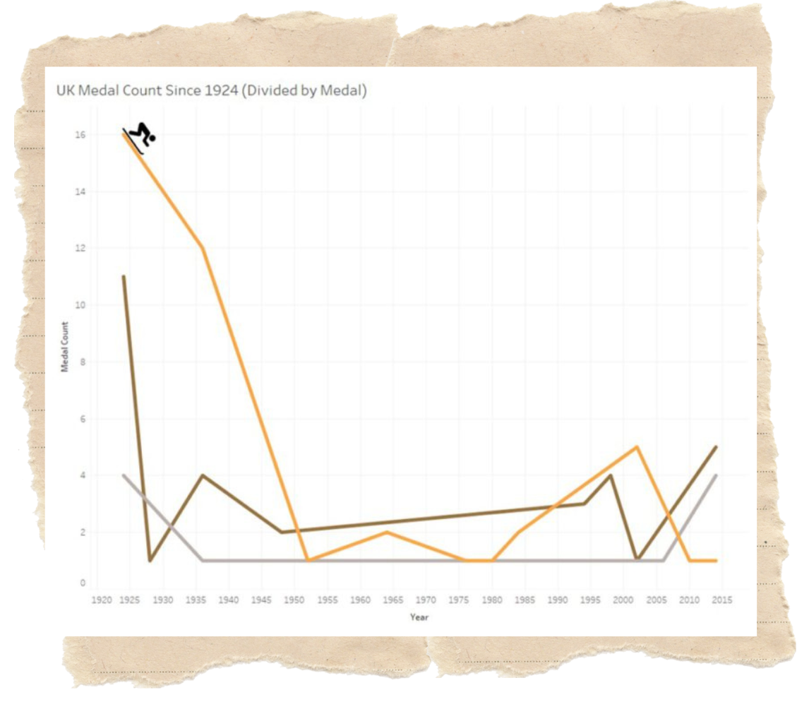
A line graph is a type of chart used to show information that changes over time. Going back to the second chart (stacked bar chart), you can see that the medal count is shown over time. This means we are not using the data visualisation to its fullest potential.
The below chart is far more suited to highlighting trends over time. Moreover, as there are multiple lines in this chart, you can easily compare the difference between the medal count since 1924. Again, useful information, but the data is only useful if it is informing what you are trying to say.
Scatter graph
The previous dataset doesn’t have enough data points to warrant a scatter graph. So instead we took the height and weight of all the Olympic athletes since 1924, divided it by event and placed it on a scatter graph. From here you can find the average height and weight of an athlete in every event.
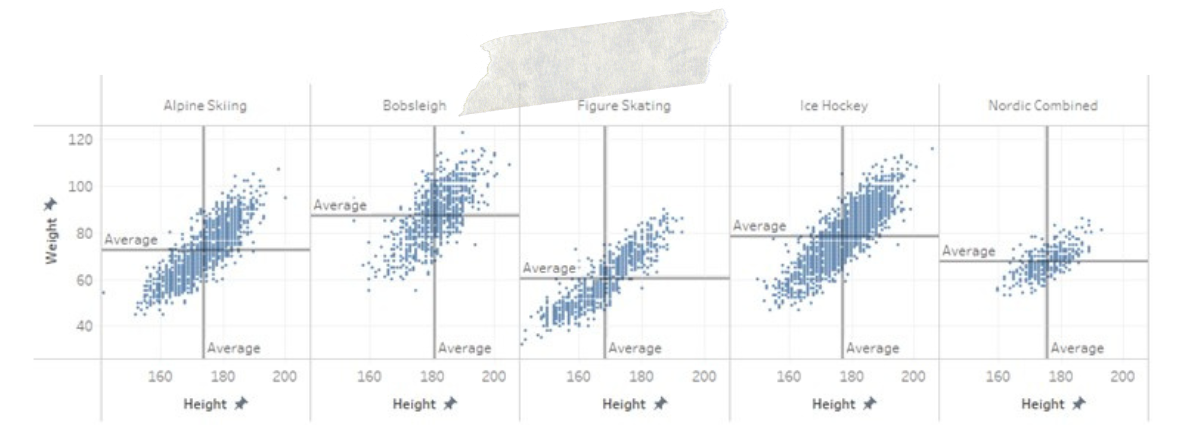
The positive correlation between height and weight is of no surprise to anyone. What is interesting is the difference between events. You can see how figure skating has the smallest and lightest athletes on average whilst Bobsleigh has the tallest and heaviest athletes on average.
Map
A heat map and a scatter graph are essentially the same. The only difference is that a heat map highlights density whilst a scatter graph emphasises trends. If your datapoint has latitudinal and longitudinal data attached to it then you can overlay your heat map on an actual map.
Whilst it wasn’t done for this project, finding the birth location of Winter Olympic athletes gives a latitudinal and longitudinal coordinate, enabling you to place it on a map and show you where the most medal-winning athletes are born. This works on smaller scales, like a single country but not on a map of the world.
A map of the world is best suited to using the in-built geographic data to effectively visualise which countries have the ‘most’ of a particular data point. Much like a treemap, this is done through colour variation. The most common of which ‘darker’ is ‘more’.
Colour outside the lines
Now that you know the basic types of charts, it’s time to experiment.
What we showed you were some of the basic chart types, but there are hundreds of variations of each one. You have circular bar plots, waffle charts, radar charts and more. So take your data, grab a chart and run with it, who knows what you’ll make.
Obviously, we’re not going to tell you everything we know, but if this introduction excites you and you want to know more, just contact us, we can DPR some charts for you.


